
Hornsense Application
Whole Communities Whole Health x University of Texas at Austin

Product Overview
It is a Health initiative taken by the University of Texas at Austin to help marginalised communities.
Hornsense is an app used by families to consolidate data from their Fitbit bands and environmental sensors.
This data is presented to them so they can make informed decisions regarding their health. Our team’s values align with such an initiative.

What are we solving?
The present users of the application have expressed their dissatisfaction with the application's numerous UX problems. Users are unable to understand the health data that was provided by their health devices and loaded on their app since the app was too complex and generates a lot of data.
Our aim as UX designers was to improve the user experience for this application, aid users in comprehending this complex data, make it more easily accessible to them than it was in the past, and subsequently assist them in making better health-related decisions for themselves.
Competitive Analysis
Designing
User Testing
My Responsibilities
Figma
Maze Tool

Tools Used
Design Process
We used a Waterfall design process for the app redesign as it involved Secondary Research and as we had to revamp of the entire hornsense application. This approach helped us to understand the issue, define the issue, Analyse it and then create a design for the new application to be tested.
Secondary Research
Competitor Analysis
Understand

Concept Maps
User Personas
Define
Card Sorting
Affinity Mapping
Analyse

Agreement Matrix
Similarity Matrix
Info Architecture
Ideate

Wireframing
High-Fidelity
Prototyping
Prototype

Feedback
Iteration
Future Scope

Testing
User Research
Based on the secondary research data, information and the gatherings that have been previously collected by other researchers and sources, we created two infographics in order to understand our user base.
From the research, we found out that : Average Age of Parents participating in this study was “34.6” which was between the range “24-44” and the average income of the participants was around “45K/yr”, range “6K-120K”.

Competitor Analysis
Three direct competitions and three indirect competitors were identified and included in our competitor study, and their features were contrasted with those of the Hornsense application. When we analysed the application, we discovered gaps in the IA and a number of other problems, some of which are listed below, which we attempted to fix in our design.


User Pain Points
Data Driven Issues :
“The data on the app is too complex to understand”
Help and Support Related Issues :
“There are no help/support options on the app which would help us in understanding how to navigate this app or help us with data privacy if the device is lost”
Navigation Related Issues :
“The current app has very complex navigation and we do not understand where to look for a specific type of data”

User Personas
We created User personas that are user profiles that represent the wants and needs of a subgroup of your target audience. These personas are an in-depth analysis of our ideal customer and their behavior patterns, goals, skills, attitudes, problems, and background information.

Information Architecture
Based on the data and access to the older application, our team sat together and created a Concept Map for the old application in order to understand the information architecture of the app and understand the gaps that might be causing issues in good user experience of the current application.
Once the concept map was created, we then performed the card sorting technique in order to understand the affinity of each of the metrics of the application. For this, we sent out a survey which to the users and analysed the results.
The survey findings were astounding, and they gave us insight into the information architecture that would best serve the users of the application and assist us redesign the Hornsense 2.0 Application's information architecture.
We were able to produce the final IA for Hornsense 2.0 using the results from agreement matrix and similarity matrix.
Agreement Matrix

New Concept Map

Similarity Matrix

New Information Architecture


Sketches/Low Fidelity Wireframes
Based on the Information Architecture and with the information gained from Similarity and Agreement Matrix, we were able to sketch out basic low-fidelity prototypes of the app that we were planning to design. This gave us a direction to work on towards creating Mid-Fidelity Prototypes


Mid-Fidelity Prototypes
Based on the sketches and the initial feedback from the users, we converted these low-fidelity sketches into Mid-Fidelity working Prototypes. All the sketches were later converted to mid-fidelity prototypes and sent to the users again for testing.

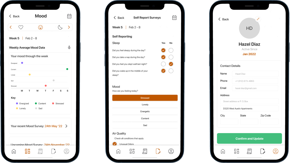
High-Fidelity Prototypes
Based on the Feedback from the users, we created a fully functional High-Fidelity Prototype which we again shared with the users for getting final feedback.

Dashboard

Air Quality

Temperature
Other Screens
Notifications so that users could easily get and understand their health metrics updates amongst other notifications.
Clutter Free dashboard with reminder for upcoming tasks.
Information about various health metrics so that the users can always look for it whenever needed under the ‘i’ button.
All the graphs related to the air quality health metrics would be available directly on the screen and users can simply scroll through it to understand different trends captured by the BEVO Beacon.
Slider for users to select from different metrics in order to navigate to a specific health metric.
Simple graphs to show the temperature trends throughout the week.

Key Takeaways
Learned how to structure information in an app environment with several constraints
Learned how to perform user research and user testing via mediator
Learned different types of information architecture and which suits our project
Importance of Primary, Secondary and at times Tertiary navigation
Learned how to work towards marginal communities and understand their issues faced.
Future Scope
Direct interaction with end users after taking IRB clearances to better understand pain points
In-person User Testing with end users
Children and their health metrics to be incorporated
Giving more control to the users
Simplified data with easier-to-understand visualizations.